A few days ago, I asked AI to revise a webpage.
All the functions were there, and the page loaded fine. But at a glance, I knew it had taken the same old path: a big headline, a subtitle, a few stats, then two rows of cards. Add some gradients, rounded corners, and shadows.
It’s hard to say this kind of page is wrong. If you ask it to explain, it can talk convincingly. But readers don’t buy it, users don’t buy it. Because it doesn’t look like a designed page, more like an average answer pulled from a pile of templates by a model.
Hallmark is a Skill made specifically to handle this. Created by Together AI, its purpose is straightforward: for coding agents like Claude Code, Cursor, Codex, it helps AI-generated interfaces avoid looking so AI-made.
What’s interesting isn’t that it invents another set of “sophistication keywords.” Instead, it’s very restrained, breaking aesthetics down into a bunch of checkable rules. If AI wants to slack off, it still has to pass these gates first.
1. It First Controls the Most Common Shortcuts
AI has a few old habits when writing webpages.
It loves to use the same skeleton: hero section, three feature cards, CTA, footer. Change the colors, and it calls it a different design.
It also loves to make up nice numbers. If the user doesn’t provide data, it still dares to write “47% improvement” or “trusted by 50,000 teams.” These numbers look good on the page but aren’t necessarily true.
There are also smaller details: fake browser frames, fake phone cases, fake code windows; suddenly italic emphasis in titles; button text squished into two lines on mobile; colors written as a bunch of hex codes in the code, with the theme losing control.
Individually, these seem like minor issues. But together on a page, they give a familiar feeling.
Hallmark’s approach is to list these “flavors” and turn them into rules. Its SKILL.md repeatedly emphasizes one thing: don’t just change the skin, change the structure.
This is a simple but crucial point. Many AI pages look different only because the colors changed. The page rhythm, information order, and module relationships remain the same skeleton.
2. Hallmark Has Four Entry Points
The README breaks down its usage into four verbs.
The default entry is to create a new page. When the user says “make a landing page,” it first assesses the project environment, then selects page structure and theme, and finally runs checks.
hallmark audit <target> is the review mode. It doesn’t change code, only reads the existing page, scores it against the anti-template checklist, and lists problems.
hallmark redesign <target> is the redo mode. It keeps the original content, information structure, and brand intent but replaces the visual structure. It focuses on how the page can be rebuilt, not just slapping a new style on the original.
hallmark study <screenshot | URL> is the learning mode. You give it a favorite screenshot or URL, and it extracts the design DNA: macro structure, font pairing, color anchors—not pixel-by-pixel copying. This boundary is important. Learning style is fine, copying someone else’s template is not.
These four entry points are clearly separated: new creation, audit, redesign, and study. It doesn’t cram everything into a vague “make it look better” request.
3. How It Works in Code
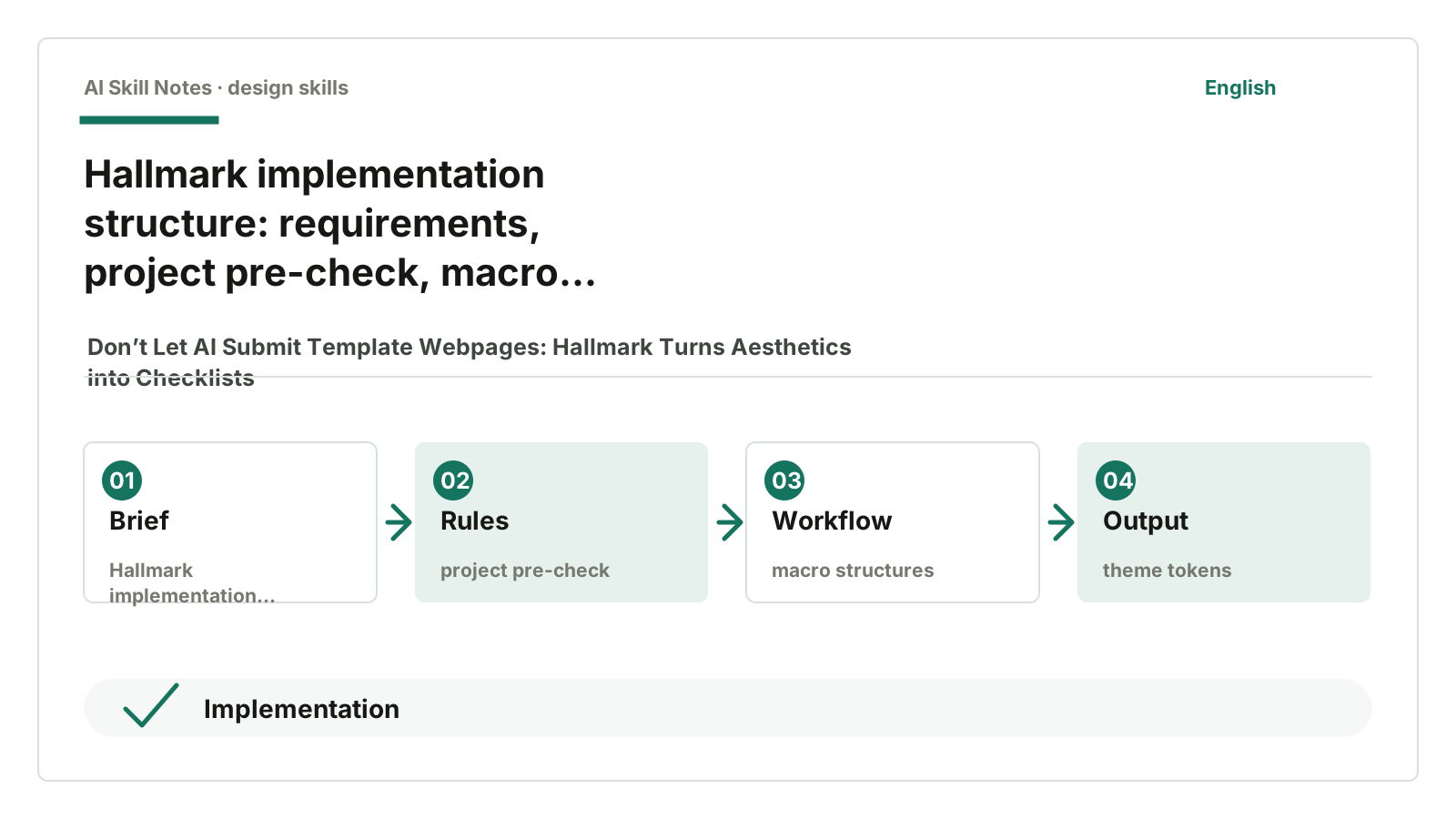
Looking at the source, you can think of Hallmark as three layers.
The first layer is SKILL.md. It handles the overall rules: first read the project, don’t randomly delete files, prefer in-place edits for existing projects, ask clearly about audience, use case, tone before designing. This Skill doesn’t encourage AI to rebuild the project from scratch but first blocks risky actions.
The second layer is references/. This holds many detailed manuals, like macrostructures.md, anti-patterns.md, and slop-test.md. These files are where the real work happens.
macrostructures.md provides page skeletons. Not always starting with a hero, but also editorial stacks, split manifestos, specimen, index walls, product cockpits, and other structures. Changing the structure first helps avoid pages looking alike.
anti-patterns.md lists bad smells. Like fabricated metrics, fake chrome frames, drifting theme tokens, random italics in titles, lazy default Specimen structures.
slop-test.md handles pre-delivery checks. The README says it has 57 slop-test gates, and SKILL.md adds a pre-emit self-critique. My understanding is: first use rules to keep AI on track, then checks to prevent obvious issues before submission.
The third layer is project memory. Hallmark writes .hallmark/log.json and a CSS stamp to record which macro structure, theme, and judgments were used. Next time it makes a page, it can avoid always picking the same pattern.
4. What’s Most Worth Learning
First, it breaks “aesthetics” down to the structural level.
Many people writing design Skills only write “sophisticated, simple, breathable, modern.” These words aren’t useless, but they’re too vague. After hearing them, the model still falls back to its most familiar templates.
Hallmark first asks: what macro structure does this page use? What form do navigation and footer take? How does it collapse on mobile? It moves the question from “does it look good” to “is the page skeleton repetitive again?”
Second, it forbids making up evidence.
Its rules explicitly say if the user doesn’t provide metrics, don’t write 10x faster or trusted by 50,000+ teams. You can use placeholders or switch to layouts that don’t rely on numbers.
This is rare in design Skills because AI loves making pages lively, and the easiest way is to invent some numbers.
Third, it treats mobile as a hard requirement.
Hallmark requires passing widths of 320, 375, 414, 768 pixels. Button text can’t squish into two lines, root can’t scroll horizontally, long titles must wrap.
This isn’t aesthetic nitpicking. Many pages look fine in large screenshots but fall apart on phones. Most readers on public accounts also view on mobile, and web products are the same. If mobile is bad, no matter how pretty the screenshot, it’s useless.
5. Public Feedback: Clear Direction but Still Early Stage
I checked some public feedback. There aren’t many stable, detailed materials—mostly GitHub README, official examples, and issues.
Positive signals are straightforward. The README shows many pages generated from different briefs and stresses they should look like different sites, not the same template with different colors. This matches its core claim: Hallmark README puts “twenty themes” and “four verbs” front and center.
Issues also reveal community focus. Issue #21 mentions applying Hallmark’s anti-slop approach to writing, showing its appeal isn’t just webpage style but the method of naming and checking bad smells. Issue #20 discusses a more open Design Skills framework, indicating it sparks a type of tool, not just a single project.
But I wouldn’t call it “widely validated in production” yet. The public feedback looks more like early-stage developer and design tool enthusiast discussions. Its value is clear, but maturity remains to be seen.
6. How to Install and Use
If you want to try, first give your AI this GitHub address:
https://github.com/nutlope/hallmark
Then say:
Please help me install the hallmark Skill from this repo. Confirm SKILL.md and references/ are present after installation.
After installation, don’t just say “make a sophisticated webpage.” Make the task a bit more specific:
Use hallmark to audit the current webpage, just list problems first, don’t change code.
Or:
Use hallmark to redesign this page. Keep the copy and information structure but redo the visual structure.
If you see a website you like, you can say:
Use hallmark to study this URL and analyze its design DNA, don’t copy pixels.
7. How You Can Write Your Own Skill
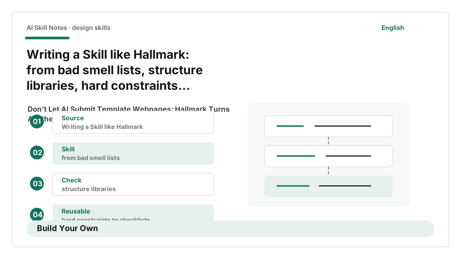
If you want to write an “anti-template design Skill,” you can learn from Hallmark’s structure.
Use case: when AI generates webpages, landing pages, product pages, or component previews, and the default visuals look too templated.
Trigger conditions: user says “make a page,” “redo interface,” “aesthetics are bad,” “too AI,” “looks templated.”
Inputs: target page, existing code, brand info, audience, use case, tone, plus user-provided reference images or URLs.
Outputs: page code, review checklist, redesign plan, or a reusable design.md.
Workflow: first read the project environment, then ask about audience, use case, and tone; next select macro structure and theme tokens; generate interface, then run anti-template checks; finally check mobile and real copy.
Key constraints: don’t fabricate data, don’t draw fake browser frames, don’t use the same structure on every page, don’t write colors and fonts randomly in code.
Optional tools: browser screenshots, mobile previews, accessibility checks, visual regression, project-level design memory.
Possible adaptations: if you write a public account article Skill, you can apply this approach. Turn “AI-style phrases,” “empty background openings,” “fabricated sources,” “stacked short sentences,” “forced uplifting endings” into check items. Don’t just say “make it more natural,” make AI know what’s unnatural.
8. My Judgment
Hallmark’s best part isn’t that it makes webpages “look better.”
“Better looking” is a slippery term. You say sophisticated, I say ordinary; you say clean, I say empty.
What’s truly useful is breaking down “looks like AI” into executable rules: don’t use the same structure, don’t make up data, don’t let theme drift, don’t break mobile, self-check before delivery.
This set is perfect for writing your own Skill.
Because most of the time, what we lack isn’t a prettier prompt. We lack a gate that blocks default answers.