Previous articles focused on the AI “flavor” in writing.
shuorenhua manages Chinese expression.
Humanizer-zh handles writing traces.
stop-slop controls clichés and template tones.
Today’s taste-skill approaches from a different angle.
It manages the interface.
You’ve probably seen those AI-generated web pages.
Purple-blue gradients.
Centered big titles.
Three feature cards.
Glassmorphism buttons.
And some glowing borders.
Each element can be explained. But together, it looks like the “default AI frontend skin.”
taste-skill aims to solve this problem.
What it does is more specific than just “making the page look better”: it first reads the requirements, then judges the design language, and finally uses a bunch of hard rules to block the most common template flavors.
1. Clarify the Source First
The taste-skill repo is here:
https://github.com/Leonxlnx/taste-skill
The repo author is Leonxlnx.
The project uses the MIT License.
There’s more than one Skill in this repo.
The README divides them into two categories:
One category is implementation Skills, responsible for generating or transforming frontend code.
The other category is image generation Skills, responsible for creating visual reference images like web pages, mobile screens, or brand boards.
This article mainly talks about the default taste-skill, whose install name is:
design-taste-frontend
It is currently at v2 experimental.
The repo also keeps the old version:
design-taste-frontend-v1
If you only want to install the default version, you can give this address to the AI:
https://github.com/Leonxlnx/taste-skill
Then say:
Please help me install the design-taste-frontend Skill from this repo.
2. It First Looks at the Page Scenario
Many people ask AI to make pages by saying:
Make it a bit more advanced.
Don’t make it too ordinary.
Make it have a sense of design.
AI understands these, but they’re too vague.
After hearing this, AI often produces that familiar answer: big title, gradient background, three cards, rounded buttons.
You say “advanced,” it interprets as “add some glow.”
You say “has a sense of design,” it interprets as “add some animation.”
taste-skill thinks differently.
It first asks: what kind of page is this exactly?
Is it a SaaS landing page?
A designer portfolio?
A redesign of an old website?
A public service page?
Different pages can’t use the same aesthetic.
A B2B page aimed at a procurement committee can’t look like an Awwwards winner.
A creative studio portfolio shouldn’t look like a backend admin system.
So the first step of taste-skill is not to write code.
It first does a Design Read.
It requires AI to clearly say in one sentence:
Reading this as: what kind of page, who is it for, what is its vibe, which design language should it lean toward.
This step seems ordinary but is very effective.
It puts “aesthetic” back into a concrete context.
3. Its Three Core Dials
taste-skill has three core dials:
DESIGN_VARIANCE
MOTION_INTENSITY
VISUAL_DENSITY
You can think of them as three questions.
How bold should the layout be?
Lower DESIGN_VARIANCE means the page is more symmetrical and stable. Higher means the page can be more irregular and creative.
How intense should the motion be?
Lower MOTION_INTENSITY means only hover and active feedback. Higher means considering scroll storytelling, magnetic buttons, GSAP, ScrollTrigger.
How dense should the information be?
Lower VISUAL_DENSITY means a more spacious page, like a gallery. Higher means a tighter page, better for information-rich product interfaces.
The benefit of these three dials is turning “aesthetic preference” into actionable parameters.
You don’t have to just say “make it more advanced.”
You can tell AI clearly: should this page be more stable or bolder? Quieter or more animated? More whitespace or denser?
This is more reliable than just saying “make it look better.”
4. How It Blocks AI’s Default Flavor
When I read SKILL.md, the most interesting part is the bans.
It lists many typical problems of AI frontend pages in detail.
For example:
- No default purple-blue gradients and glowing buttons.
- No immediately making three identical feature cards.
- Don’t make every section a small eyebrow title plus a big title.
- Don’t stuff version numbers,
BETA,EARLY ACCESSfake tags in the hero. - Don’t use fake screenshots. That is, don’t piece together a bunch of
<div>s to look like a product dashboard. - Don’t misuse em dashes.
- Don’t use obviously fake names like
John Doe,Acme,SmartFlow.
These sound trivial.
But bad page flavor often hides in these details.
One page using three cards is not a big deal.
But every AI page using three cards is a problem.
One hero with a gradient is fine.
But every time it’s purple-blue gradient, centered big text, glowing CTA, readers instantly know it’s an AI template.
taste-skill’s value is breaking down these “something feels off” feelings into checkable rules.
5. It Doesn’t Just Say “No”
If a Skill only writes bans, it easily forces AI into another kind of rigidity.
A good thing about taste-skill is it offers alternatives.
For example, it doesn’t let AI randomly rebuild design systems.
If the requirement is like Microsoft enterprise apps, use Fluent UI.
If it’s Google style, consider Material.
If it’s IBM B2B, look at Carbon.
If it’s public service, check GOV.UK Frontend or USWDS.
If it’s just an aesthetic like glassmorphism, Bento, Brutalism, Editorial, it clearly says: these are visual styles to be implemented with CSS, Tailwind, or component libraries, don’t pretend there’s an official package.
This is quite practical.
Many AIs say “like this style” but write “use this design system,” which sounds professional but is nonsense.
taste-skill adds a layer of factual constraint here: use official packages for official design systems; for aesthetic styles, honestly say it’s a style, don’t fake a system.
6. Its Pre-Flight Check Is Heavy
taste-skill ends with a big Final Pre-Flight Check.
This part is like a pre-launch checklist.
It asks AI to self-check many things:
- Did it first do a brief inference?
- Are the three dials justified?
- Does the CTA text wrap properly?
- Is button contrast sufficient?
- Does the hero fit in the first screen?
- Is the desktop navigation on one line?
- Are there duplicate CTA intents?
- Are there real images instead of just text or fake screenshots?
- Is there a clear folding scheme on mobile?
- Does animation respect
prefers-reduced-motion? - Are
useEffectanimations cleaned up? - Is
h-screencausing mobile height issues?
This is no longer just “aesthetic advice.”
It’s closer to a frontend delivery checklist.
I think this is the most valuable part of taste-skill.
It breaks “don’t be ugly” into many verifiable small issues.
AI hates this kind of checklist.
Because it pulls AI from “I roughly did it” back to “did you really do it?”
7. Who Is It For
If you often have AI write frontend pages, this Skill is worth checking out.
It’s especially suitable for these scenarios:
- Making landing pages.
- Creating personal portfolios.
- Redesigning an old website homepage.
- Making brand showcase pages.
- Having AI generate pages based on reference images or product vibes.
But it’s not suitable for all frontend tasks.
It clearly states: main scenarios don’t include dashboards, data tables, multi-step forms, code editors, native mobile, real-time collaboration UIs.
These have their own design systems and interaction rules.
Forcing taste-skill on them might cause problems.
So don’t treat it as a “universal frontend aesthetic package.”
More accurately, it’s suitable for marketing pages, portfolios, brand pages, and visually driven redesigns.
8. What’s Most Worth Learning from This Kind of Skill
When I dissect taste-skill, I focus on how it writes rules.
Some rules are strict. For example, completely banning em dashes or default dislike of Inter font. In specific projects, these judgments might not always hold.
But its approach is worth learning.
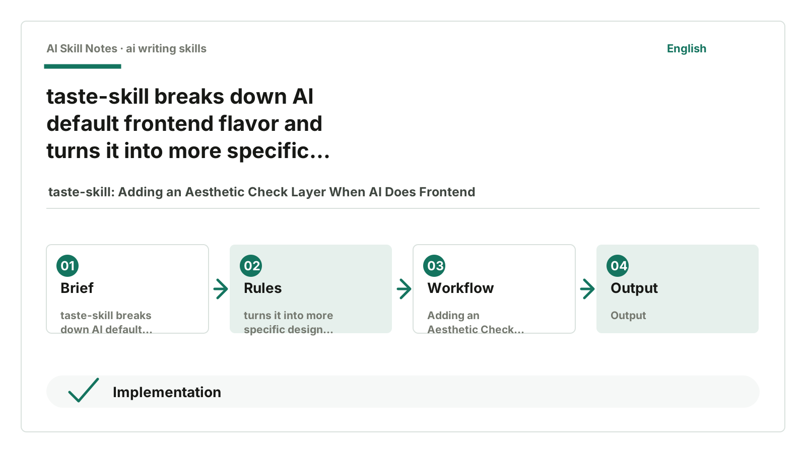
It doesn’t stop at vague “make the interface more advanced” talk, but breaks aesthetics into a process: first read the scenario, then set dials, then choose design system, then list common AI bad flavors, then give alternatives, and finally finish with a checklist.
This structure can be applied elsewhere.
For example, if you want to write a “WeChat article style Skill,” you can break it down similarly: first read the audience and article type, then set tone, information density, and example ratio, then list banned sentence patterns and allowed alternatives, and finally provide a pre-release checklist.
Writing this way is more actionable than just saying “write more like a human.”
9. My Judgment
The most valuable part of taste-skill isn’t design terminology but engineering aesthetic judgment.
Aesthetics can’t be fully solved by checklists. But without checklists, AI easily falls back to default templates. Especially for frontend pages, the model is too familiar with that set: centered hero, three cards, purple-blue gradient, glass buttons, fake screenshots. It looks passable, but just passable.
taste-skill at least forces AI to ask more questions: who exactly is this page for? Should it be stable or bold? Should it use a design system or just a visual style? Should this animation be used? Is this screenshot real?
Asking these questions already makes the page much better than the default template. That’s why I think it’s worth talking about.